Required section · Section 2 of 6
What a stable chart looks like
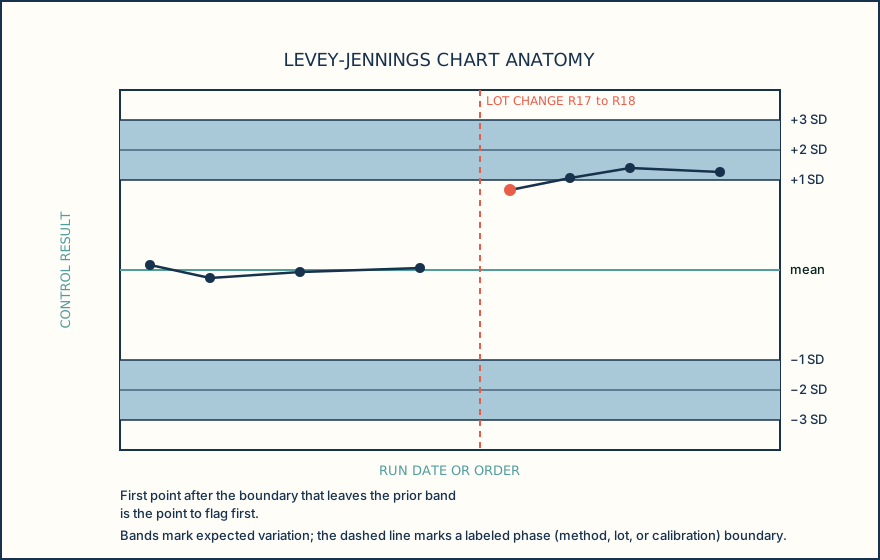
A Levey-Jennings chart plots sequential control results on a time or run-order axis against an established control mean and standard-deviation (SD) limits for that control material, level, and method. The chart should also identify the control level being plotted and the lot or method phase in force, so a point is never read across an unmarked process change such as a new reagent lot or a recalibration. Without a marked phase boundary, an apparent shift can hide inside what is really two different processes plotted as one line.
For a normally distributed set of control results, about 68.27 percent of points are expected to fall within plus or minus 1 SD of the mean, about 95.45 percent within plus or minus 2 SD, and about 99.73 percent within plus or minus 3 SD. These percentages describe a theoretical normal-distribution model. They are not proof that any one control dataset is normally distributed or stable; they set the expectation you compare real points against.
In a stable process, points scatter randomly above and below the mean, mostly within 1 SD, occasionally out to 2 SD, and rarely at 3 SD, with no sustained direction and no repeating shape. That randomness is the baseline you are trained to recognize so that a real pattern stands out against it. The figure below shows the chart's anatomy: the run-order axis, the mean line, the SD lines, and a labeled phase boundary marking a lot change.
Reading the chart is a short, repeatable sequence: confirm which control level and phase you are looking at, locate the mean and SD lines for that level, compare each new point and the recent run of points against those lines, and only then decide whether what you see is ordinary scatter or a pattern that needs a closer look at the event log. Know the level and the phase before you judge any point on the chart.
Illustrative drawing — this picture was drawn rather than captured.
A repeatable sequence for reading any control chart before you judge a point.
Confirm level and phase
Identify which control level is plotted and which lot or method phase is current, so you never compare points across an unmarked process change.
Locate mean and SD lines
Find the established target mean and the plus and minus 1, 2, and 3 SD lines for that level and phase before reading any single point.
Compare the point and recent run
Look at today's point and the run of recent points together, not in isolation, checking position, direction, and spread against the SD lines.
Name the pattern or clear the run
Decide whether what you see is ordinary random scatter or a nameable pattern; if a pattern is present, move to the event log rather than to a conclusion.
Knowledge checks
Reading and checks are open. Sign in only to save.
Knowledge check 1
Knowledge check 2
Section status
Finish this section
Reading and checks are open. Sign in only to save.
The module finishes after every required section is marked done and every check in those sections is correct.